Project 7
World Heritage Site
Shrines and Temples of Nikko, Japan
Part 1
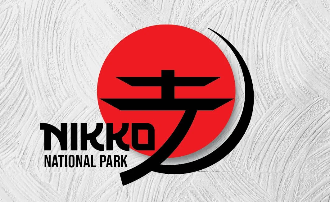
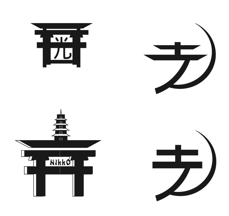
This simplistic design reflects the environment and stylistic elements that make up Nikko, Japan. Inspiration for the temples is shown in the top half of the logo. While the circular aspect brings your eyes down to the name and then back up to the top. The use of color is not only to make it pop but represents one of Japan's most sacred colors.
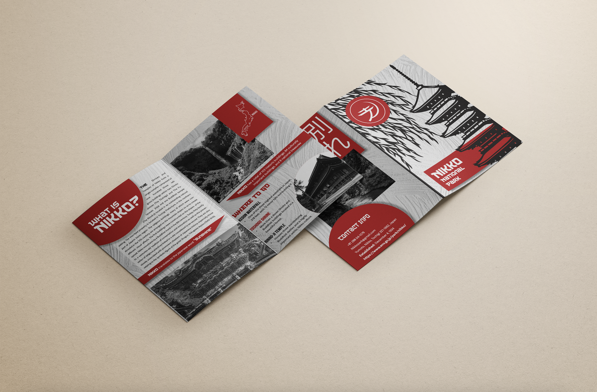
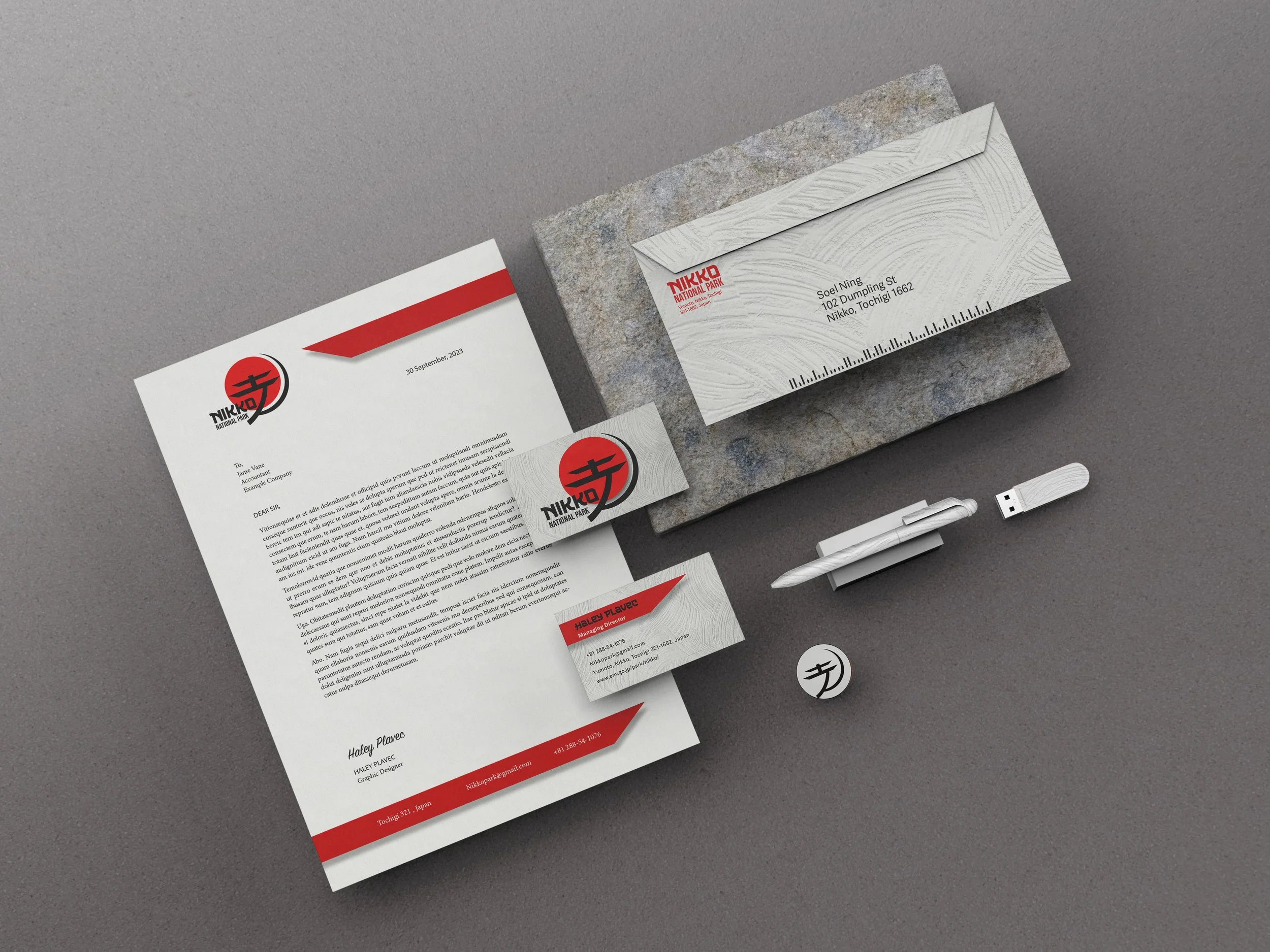
The Banding sheet shows a multitude of various ways the logo can be used. The sharp edges found in the fun facts background shapes are tied back to the sharp edges of the logo. Instead of adding photography on the front of the brochure, a draft image was used on top of an off-white Japanese texture background. The background creates a softer emotion which allows for there to be depth within the typography.
Part 2
Branding
Part 3
Stationery
Developments
Original
Updated
Process Work

