Project 5
Magazine Spread Reboot
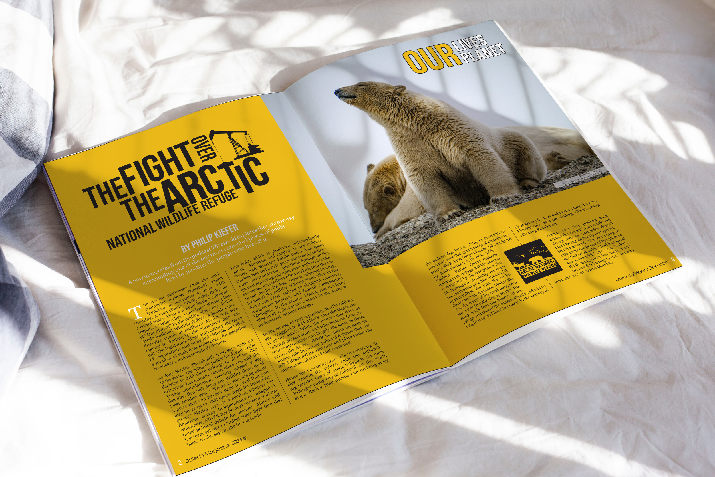
While designing it’s important to pull readers in and engage them within a layout. The idea that our eyes flow from one element to the next creates an entertaining way for readers to retain information.
Throughout the layout and hierarchical development, viewers can’t help but start to imagine the purpose of the design. The strong dark yellow background allows for a sensation of caution and promptness, while the piercing black calls out a sense of urgency.
Developments
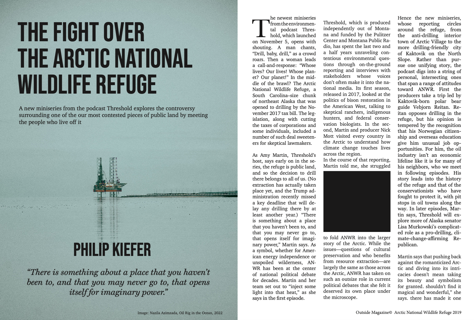
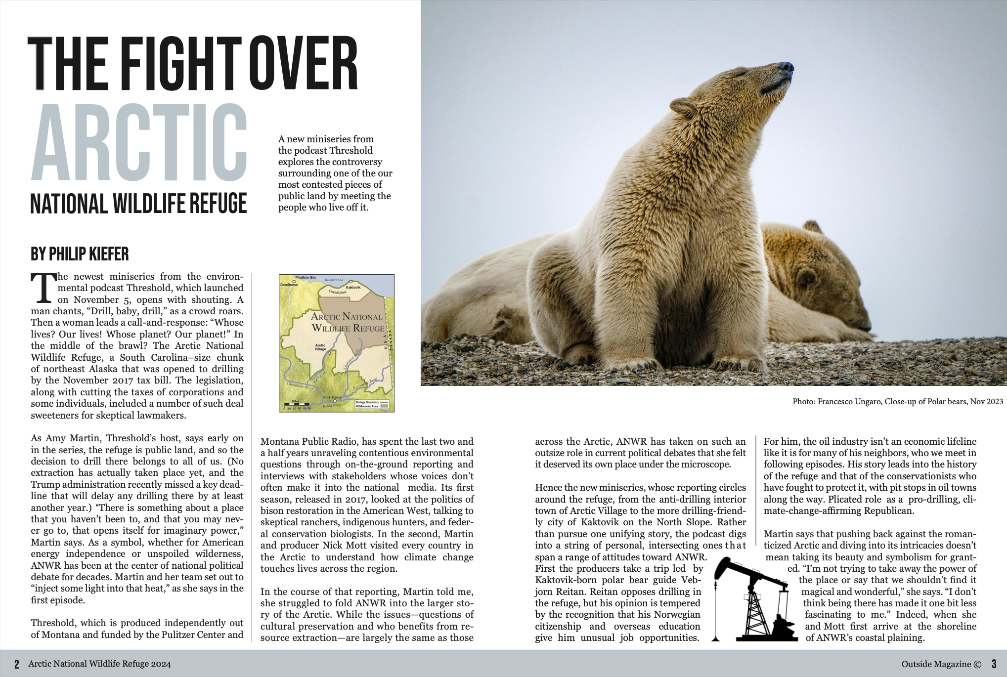
Original
Updated
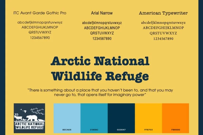
Process Work


